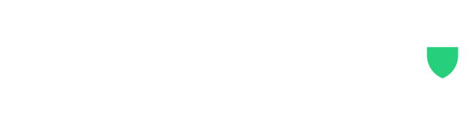

In light of the 25 years of Armour Insurance and all of the big things that are going on, we thought that now was the time to announce that we are rebranding! For over a decade, the Armour brand has used the familiar A emblazoned shield (pictured below). While this logo has been iconic, and served us well, we felt that it did not fully represent who Armour is today.
Old Brand
.png?width=750&name=Old%20Logo%20Brand%20(2).png)
The big strong capital letters were indicative of a strong Armour brand. The big bold letters sent a message of "we are strong and sharp," all of which is true. The colours of the brand were cool steel tones that were a nod to a knights suit of Armour.
While this had served the organization well, we needed to ask ourselves, "is this who Armour is today?" While this was once the brand that represented Armour, we felt that the brand needed to be revitalized. We want to enter the next quarter century of Armour with new lease on life.
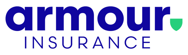
New Brand
.png?width=750&name=New%20Armour%20(3).png)
Behold, the new Armour brand!
The vibrant colours of the new brand are much brighter and more inviting. The bright blue colour sends a friendlier tone than the previous cool toned blue. The symbolic Armour shield has received a stunning redesign as well. The vibrant green shield will become a fixture of the Armour brand. Additionally, the lower case Armour letters, offer a softer more approachable view while the all caps INSURANCE highlights our our specialty.
As Armour celebrates 25 years of business, we are absolutely thrilled to announce the next chapter of our story. We look forward to serving our clients and partners for many years to come! We are so excited for the Armour rebrand, and we hope you are too.